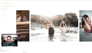
Portfolio Review #001
I recieved so many portfolios from you guys and they keep coming! I’ve been really enjoying looking at your work and as much as I’d like to talk about EVERY portfolio, I can only get to a few. Please know that if I don’t choose your website, it’s not because I didn’t like it, however I chose portfolios that I felt stood out. We all have room for improvement. I know I have tons of room for improvement. In fact, that’s what keeps me going with photography. The fact that I’m always working on my craft and can always challenge myself to grow, to improve, and to work harder. I have friends that I trust to look at my work and give me feedback. Some are in the industry and some I just trust their eye. So please know that my critique of your work is only my opinion. It’s not personal, so plesae take what I say with a grain of salt.
I’m not only looking at your work, but I’m also looking at your website. I’m looking to see how it flows, how it’s laid out, the interface, navigation etc. There are many things that I value in a good website and there are things that I find really annoying. And I’m not alone. Most folks have a very short attention span when it comes to the web. If your website doesn’t function quickly and is well laid out, chances are people are going to move on.
Here’s a few portfolio website Do’s and Don’ts.
– Do keep it simple. Less is more. There’s no need to have tons of links to galleries unless you are a campaign or project-driven photographer.
– Don’t have music embedded into your site. There is NOTHING worse than landing on a website and having music play that you don’t like and don’t want to hear. That’s an immediate turn off and for me, I won’t even look at a site with music embedded.
– Do keep it clean. Make sure the navigation and links and layout is clean and easy to use. Complicated navigation and busy graphical elements take away from your work and are a turn off for visitors.
– Don’t talk about your gear! Nobody cares! Seriously, unless you specifically shoot film or tintype or something unique, there’s no need to devote a page to your cameras and lenses etc. Sure, maybe if your Joe McNally or Zack Arias, but for those of you guys that are relatively unknown, nobody that’s hiring you cares what you use.
– Do have social media links, contact info and call to action info that’s easy to find. If someone goes to your website, you want to drive them to your FaceBook, Twitter, Instagram, and have them email you to contact you. Make it easy.
– Don’t put up work that isn’t part of your portfolio. That stuff can go on your blog. Your portfolio should be cohesive.
If you want to submit your website portfolio for review,
Email me at adamlernerphoto@gmail.com
Put “Portfolio” in the Subject
Past the link to your portfolio website in the body of the email.
Please do not send Flickr, Facebook or 500px galleries. I will not look at them.
Please don’t write a long email about yourself or your work. As much as I like hearing from you,
I won’t have a chance to do much more than look at your portfolio.
Please subscribe and leave your questions and comments below.


